Thursday 31 March 2011

The Cult of Beauty: The Pursuit of Pleasure

Short review published in London Festival Fringe http://www.londonfestivalfringe.com/indexposttag.php?slug=amita-murray

I can’t get enough of Pre-Raphaelite art, or maybe it is their relentless pursuit of beauty and sensuality for their own sake, and pleasure in all things decadent (with a dash of addiction and paranoia thrown in for good measure) that is so intoxicating. The Victoria and Albert’s delicious collection of art from the Aesthetic Movement (1860-1900) reunites paintings from the second wave of the Brotherhood, which included Dante Gabriel Rossetti, William Morris, and Edward Burne-Jones, with writers Oscar Wilde, and Algernon Swinburne whose poems were often inspired by paintings like Rosseti’s The Blue Closet (1857), and furniture by artists like Edward William Godwin.
Having faced all kinds of controversy in the 1850s about their art and their morals (or lack thereof), and the blinding rivalry and incestuous sharing of models within the group, the Pre-Raphaelite Brotherhood in its first avatar had petered out, and given way to this second group. This group shared many of the concerns of the first, and their goals and aims were in tandem with many other artists and intellectuals of the second half of the nineteenth century - to produce art that was free of pious moralizing and prudery, to create work that was not based on narrative, classic texts, commercialism, materialism or the ugliness of the Industrial Revolution and the Great Exhibitions, to follow and worship nature and feeling in their art, and to live life by those same ideals. The Brotherhood was interested in the form of a painting, rather than its narrative, and synasthesia was a common goal.
In 1862, Rossetti’s set congregated in Tudor House, Chelsea, like bees swarming around a pot of honey. They painted a bevy of flame-haired women, some pale-faced and consumptive, with an unconventional beauty that was enticingly out of reach – using models who looked like Lizzie Siddal, who died in 1862 of an overdose of laudanum, before Rossetti moved to Chelsea; and others who were riper and earthier, like Jane Morris, another of Rosseti’s obsessions, albeit married to one of his cronies. Not everyone in the set was in a single-minded quest for notches on their bedpost, however, or in helping models make the smooth transition from artist’s studio to bedchamber. Frederic Leighton’s black-haired Pavonia (1858-9) is an exquisite oil of a woman framed with peacock feathers, who he paints with haunting devotion and clinical detachment. A portrait of his favourite muse Nanna Risi, the painting communicates the movement's ideals of feminine beauty and sensuality, and indeed, peacock feathers.
Punch cartoonist George du Maurier satirized this heedless pursuit of pleasure. He found the Movement’s penchant for blue-and-white china, Japanese screens and ceramics, sun flowers and peacock feathers to be especially worthy of ridicule. Critics of the movement derided the main followers as aesthetes, dandies, people with no control, discpline, or substance, people who blindly followed ideals set by "the continent," and more locally, by Walter Pater in an infamous conclusion to his book that advocated that people live life with directness and intensity. There are links between many works of art produced in the height of the movement. Frederick Sandys's picture of an angry young woman with a trail of curly hair in her mouth (1868) inspired the poet Algernon Swinburne, an ardent follower of the ideals of the movement. Symphony in White No. 1: The White Girl (1860s) is perhaps inspired by Wilkie Collins's Woman in White. Aubrey Beardsley's The Toilet of Salome (1894) illustrated Oscar Wilde's controversial play.
The Movement was spurred by Baudelaire’s insistence on l’art pour l’art, by the literary set’s antipathy to writing literature that only inspired self-righteous moralizing, and by the ugliness of the Industrial Revolution, and it went on to inspire the Art Nouveau, Art Deco and the Art and Craft Movements. Some trace the influence of the movement in J.R.R Tokein's work.


Pavonia, Frederic Leighton, 1958-9

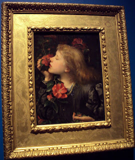
Choosing, George Frederic Watts, 1864

Bocca Baciata, Dante Gabriel Rossetti, 1859

stained glass, Edward Burne-Jones

The Cult of Beauty
Victoria and Albert
April 2-July 17, 2011


Tuesday 29 March 2011

The Importance of Being Yohji Yamamoto

Yohji Yamamoto’s signature style makes you stop, blink owlishly and ask yourself the question: is he kidding? His clothes often look over-sized. Seams are flagrantly exposed. And flaps of quilted or felt fabric that would look more at home in Heal’s than in a prĂȘt a porter collection, look tacked on by safety pins. You turn up to a menswear line (like Fall 1998, modelled by Vivienne Westwood and Charlotte Rampling, amongst others), there isn’t a man in sight on the catwalk, and the female models are wearing flat Japanese shoes, long skinny skirts and swathes of chiffon. So, is he kidding? A little, yes. Is he ever serious? Yes, probably. In a kooky, ironic, finger-at-the-establishment, po.mo. kind of way, he is poking fun at the deadly seriousness with which the fashion world treats clothes, collections and bodies. Well, maybe. No one really knows.
Following hot on the heels of the Barbican’s Future Beauty, the Victoria and Albert’s retrospective of Yamamoto’s career spans thirty years, and mixes standard issue mannequin displays, with multimedia installations that tell you about Yamamoto’s life and work, and show the timeline of his collections. Peppered throughout the museum are further displays that share secret liaisons with the museum’s more traditional exhibits, from Trajan’s Column to Rodin’s writhing sculptures. In the main exhibition hall (which is for some reason lit and heated like a furnace) a quilted and be-furred Victorian-style jacket and long skirt nestles close to a sumptuously simple asymmetric red felt dress sewn together in skewed blocks. A gray-and-red chequered, two-tiered dress stands next to a canary-yellow frothy confection, shaded by a hat the size of Honduras. The gray-and-red strapless dress could be a mad person’s take on a business suit, but features instead in Yamamoto’s 1998 Sp/Su wedding collection called Playing with Tradition, where models walk with eye-popping solemnity down the aisle in their lampshade dresses, holding foamy bouquets made of net, quirking an eyebrow at the stereotypical sentimentality of wedding rituals.
Born in Tokyo in 1943, Yamamoto lost his father in the war, and grew up with his widowed mother, which some critics like to link to his penchant for using the deepest, darkest of blacks for his collections, ironically referred to as “post-Hiroshima” chic. He completed a law degree, then switched his attention to the fashion world, and launched his fashion label Y’s in the 1970s. He quickly became notorious for making garments that looked oversized and unfinished, and that too in the 1980s when everyone else was having an orgy with undersized Lycra. Over the years he has collaborated with filmmaker Takeshi Kitano and photographer Wim Wenders. Pina Bausch’s dancers wore Yamamoto’s clothes for the twenty-fifth anniversary of the dance company, and Yamamoto appeared on stage in a rare appearance as a karate aficionado. Both Bausch and Yamamoto’s work is inspired by the harmony between what should and should not be seen. Keeping with the wabi-sabi theme of his life and work, his company was declared bankrupt in 2009, a detail that the V and A exhibition chooses not to harp on.
Yamamoto is a designer whose clothes are often admired for two things. For being sensationally wearable (like his 2002 collaboration with Adidas to launch the Y-3 line), and intensely avant garde. The V and A collection is an effervescent selection of Yamamoto’s life and work, but it tries hard to highlight the deconstruction and theatricality of his clothes, often at the cost of the starkness of his style. It tries so much to be full of what Levi-Strauss would call “floating signifiers,” the glam and pastiche of post-modern clothing, and the lavishness of Yamamoto’s disregard for the fashion establishment, that it gives the retrospective a slightly un-tethered, pupils-dilated, frenzied look.
Read short review on London Festival Fringe. Longer article coming up in Radia magazine. http://www.londonfestivalfringe.com/indexposttag.php?slug=amita-murray
Exhibition, Till July 10, 2011, V and A

Monday 28 March 2011

Does Po.Mo. Mean Grim?

(Published at London Festival Fringe http://www.londonfestivalfringe.com/indexposttag.php?slug=amita-murray)
When I think of 1970s New York artists, living in communal lofts in the wake of free love, the second wave of the feminist movement, and Vietnam war protests, I imagine a collective driven by hope. But as the Barbican exhibition reveals, the artists were interested in the grim reality of urban decay and chronic unemployment, the horrors of industrial waste and homelessness, and George Orwell-style nightmares of a fractured and hyper-anxious society. The soundscore is industrial noise, grating and static, a refrain more suited to Neill Blomkamp’s District 9 than to post-modern dance.
Making work a decade after Judson Dance Theatre, Trisha Brown (a member of Judson), Laurie Anderson, and Gordon Matta-Clark shared the collective’s concerns. Dance was about pedestrian movement, stepping out of the proscenium, saying “no to spectacle” (Yvonne Rainer), and exploring alternative surfaces.
Watching Brown’s famous Walking on the Wall (1971) is a discombobulating experience, like you’re witnessing the moonwalk – not the Michael Jackson avatar, but rather people gliding on the moon’s surface, moving their limbs with deliberation to keep them from walking off in a different direction from the rest of their body.
Matta-Clark set up an enormous dumpster called Open House (1972) in SoHo, and invited people to walk in and out of its maze-like corridors. He made it a hobby to collect “gutter spaces” in New York, unusable and unsustainable buildings, at local auctions.
Anderson was interested in technology. Her installations range from a table on which you place your elbows, so that your arms function as earphones; a ghostly electric chair, part of a derelict recording studio, that moves of its own accord, rotates at odd moments, flickers on and off; and a ten-inch clay model, a “fake hologram with sound” that talks to you about its experiences on a shrink’s couch.
Pioneers of the Downtown Scene, New York 1970s
Barbican Art Gallery
Till May 22, 2011

Saturday 26 March 2011

Anna Karenina: The Perils of Russian Loving

Photo: Robert Workman

Read short review on London Festival Fringe http://www.londonfestivalfringe.com/indexposttag.php?slug=amita-murray and longer review on The London Word

Helen Edmundson’s rapturous adaptation of Leo Tolstoy’s towering epic Anna Karenina, brought back to life at the Arcola Theatre this spring, is as much about Levin’s idealistic love for Kitty as it is about Anna’s fatal attraction for Vronsky. Max Webster’s skilful direction and a considerably talented cast of actors and physical performers supports Levin’s journey from faltering, wrought declarations of his love to Kitty which she spurns, through the throes of unrequited love, to his eventual acceptance that love is not the perfect dream that he has imagined – that the reality both falls short of, and ultimately trumps, the fantasy.
Anna, meanwhile, satisfies her hunger for meaning in life by falling for Vronsky, a dashing Byronic military man and jockey, who heats her blood like her prosaic husband, twenty years her senior, with his righteous lectures on local politics and big offending ears never could. As Alanis Morissette would say, every hot blooded woman needs an object to crave, and Anna is no exception. Anna’s craving for Vronsky eventually leads her from the empty life of a social butterfly to complete social suicide.
Forming the backdrop are Anna’s brother Stiva and his wife Dolly who struggle to come to grips with Stiva’s chronic infidelity. A theme throughout the book and the play is the idea that though society a tickled by the sexual adventures of men, women pay the price for their own and their partners’ illicit passions – though the truth is, suggests the book, that women pay the price no matter if they follow those passions or not. Dolly chooses her family over her own feelings, and sticks it out with Stiva, even though she knows her happiness is threatened by the next housemaid in a short skirt or the Bolshoi’s next favourite dancer. Anna pays the price of giving up her son and losing the goodwill of the Petersburg gentry when she leaves her husband to travel with Vronsky through Europe. When they return, Vronsky carries on as usual, dining, drinking and cavorting with his friends, while Anna is refused entry into society. As always, Tolstoy gives us a weary view of the world.
Using a trendy theatrical devise, the actors change clothing and accessories to take on multiple personalities. They become abstract figures at times, and towards the end of the play they come together and transmogrify into the train that is to be Anna’s destiny. The set is transformed with zip and verve into the snowy Russian countryside, the streets of Moscow, a railway platform, a sparkling drawing-room, and a votive-lit altar. The scene where Anna and Vronsky dance in the street, as snowflakes flutter all around them, and later when spring blossoms, is bewitching. The Arcola’s new site, a nifty warehouse-conversion on

Ashwin Street
, with seats on three sides of the stage, and even a row of “balcony” seats, adapts well to the shenanigans of the cast. In one memorable scene, Anna is transformed into Frou-Frou, Vronsky’s horse, that he rides with so much thrust that the mare has to be put down.
No one can accuse Tolstoy of brevity, and the danger of adapting his work is not knowing when to stop. It is difficult to adapt something as looming as a Tolstoy novel, one that appeared as a serialized epic (1873 to 1877, The Russian Messenger.) This two-and-a-half-hour adaptation tends to drag a little, but despite that, it convincingly weaves multiple storylines with physical theatre, spiffy set direction, a dash of humour, and a lilting soundscore. Vronsky provides humorous interludes by performing a caricature of the love struck lothario, and cast members with a black mask on the face play Anna’s nightmare of death. This is not the first time Helen Edmundson has set herself the task of adapting a heavy duty Tolstoy epic. She adapted War and Peace for the National Theatre in 1996, and put her lightness of touch to George Eliot’s Mill on the Floss for Shared Experience Theatre. While she retains the dark passions of Tolstoy’s novels, she sprinkles joy and humour into the adaptation, that keeps the story from being entirely grim and cynical.

Anna Karenina
Arcola Theatre
Till April 16, 2011


Wednesday 23 March 2011

Watercolour

Review at London Festival Fringe http://www.londonfestivalfringe.com/indexposttag.php?slug=amita-murray
If you think watercolour is too airy-fairy for your tastes, and when you look at a contemporary watercolour you can’t tell if there is a painter behind it, or if someone had an accident with the beaker of water in which they clean their paint rag, well, think again.
One of the stars of this extensive exhibition is none other than Pre-Raphaelite Edward Burne-Jones. While Burne-Jones’s artistry in the bedroom never reached the lore of Dante Gabriel Rossetti’s, and his paintings don’t have the ravenous passions of his idol’s, Burne-Jones’s Clerk Saunders (1861) reveals Rossetti’s influence. Painted (though you wouldn’t believe it) with watercolour and gum arabic, the picture relishes browns and reds to display a relationship between two women that seems based on smouldering desire and crippling repulsion. The women may be two entities or alter egos, and bring to life the classic Pre-Raphaelite model – red-haired, other-worldly, melancholic, and fatally consumptive. Other contemporaries like Rossetti and John Ruskin feature in the exhibition.
Tate Britain brings together paintings that span the last eight hundred years of watercolour – a fiddly, time-consuming medium that has been used to illustrate new species, maps, manuscripts, moods, and exotic locations. Walking around the exhibition, it is just as likely that you will bump into a detailed and precise illustration simply titled Figs (by Jacques le Meyne de Morgues, from the sixteenth century) as you are to stumble across a decadent fantasy titled Hhareem Life, by John Frederick Lewis (1857), a man who would certainly never have been allowed inside a harem in all his years living in Cairo.
In the early nineteenth century, watercolourists decided they had had enough of the art world’s oil snobbery, and launched the Society of Painters in Water Colours and the New Society, to proclaim their equal standing as artists.

Clerk Saunders, 1861, Edward Burne-Jones (Tate)

Hhareem Life, Constantinople, 1857, John Frederick Lewis, (Laing Art Gallery, Tyne and Wear Archive Museums)

Friday 18 March 2011

Hoppe Portraits: Fair Women and Flappers

                  Tilly Losch, 1928. 2011 Curatorial Assistance, Inc/E.O. Hoppe Estate Collection

Regent Street, London, 1934. 2011 Curatorial Assistance, Inc/E.O. Hoppe Estate Collection

A robust matron wrapped snugly in a wool coat, fox tail draped with a singular lack of irony around her neck, chest proud and hips thrust out at the commuters behind her, waits to cross a street in her West End shopping spree (1934). She clutches her handbag tightly to discourage the London pickpocket. A waitress Miss. Vyse, the first “Nippy” to have starred in J. Lyons and Co. advertisements, looks the picture of kindly but promising virginity, as she stands poised, balancing an empty silver tray in one hand (1925). “Sandwich Board Man Advertising Shafi Hindustan Restaurant” grins at the camera, with a billboard around his neck in war torn Britain (1945). These are just a few of E.O. HoppĂ©’s sensitive, droll and unsentimental snapshots of city life in London between the two world wars.
It was the end of the British Empire, the loss of innocence brought on by a savage First World War that yet had no premonition of the horrors of the second, and a time of blatant appropriation from the colonies of the “Orient.” Yet it was also the era when young women shed their beribboned corsets, unshackled their zippy bosoms, and demanded the right to work and vote, and artists and intellectuals lounged in smoking rooms and artists-only soirees, and theorized about sex, psychology, and the cavities of the human mind. HoppĂ©’s invaluable archive of this lost time period is one of the most probing and influential of the modernist photographers, yet the collection was all but lost to posterity when HoppĂ© in a feat of spell-binding self-deprecation sold his collection to an anonymous London library in 1954, where it was catalogued by subject and scattered in dusty, lightless hallways, till it was reconsolidated forty years later. Though his work was more often published and written about in the early decades of the twentieth century than that of his contemporaries like Alfred Steiglitz and Paul Strand, for many years his name was not listed as one of the great modernists.
His portraits show serious-browed shaggy-moustached young men with thin, frowning faces; languishing flappers in Grecian sparkly dresses ready to break into a Charleston if they can but lift their boneless limbs from the lusty Oriental couch at their side, like Teddie Gerard (1915) who wowed London audiences at the Hippodrome in Hullo, Ragtime!; and lavishly costumed Russian dancers like Vaslav Njinsky as the Spectre de la Rose (1914), a flower child sewn with dying rose petals.
Scornful of the idle rich, HoppĂ© was clear-sighted in his interest in women who were thinkers and doers, women who would plot the course of the early feminist movements. His own wife Marion was an enterprising woman and ran a London dressmakers. She helped support the couple after HoppĂ© left his bank job to become a professional photographer. Yet, despite his enlightened views on femininity, HoppĂ© was very much a man of his times. While many of his portraits are etched with glittering captions – dancer Ted Shawn (1922), the haunting actress Tilly Losch (1928) with her uncontainable beauty, Frederick Ashton’s favourite muse Margot Fonteyn (1935) when she was a mere sixteen-year-old chit, others are simply and with spectacular generality and arrogance titled “Cuban Beauty” or “Haitian Beauty.” At the same time, a portrait of Madame Wellington Koo (1921) is suffused with a mystical and other-worldly fog, and accessorized with the tiny generic figure of a robed Chinese man.
Like other intellectuals of the early modernist period, HoppĂ© was deeply interested in personality type, and strived in his portraits to find the meaning behind the face. Besides his pursuit of “Fair Women,” HoppĂ© photographed many celebrated men like Albert Einstein, sexologist Havelock Ellis, playwright George Bernard Shaw, New York intellectual Paul Robeson, and the Duke of York before he made his now-Oscar-winning “King’s Speech.”
The only danger with consuming this exhibition is that it is like eating dark Swiss chocolate with a glass of bubbly – once you start, you just can’t stop.


Hoppe Portraits: Society, Studio, Street
National Portrait Gallery
Till May 30, 2011

Wednesday 16 March 2011

New Asian Writing

My short story Durga and the Holy Cow has been selected for publication in the 2011 New Asian Writing Anthology. The print version will come out at the end of the year, but it is right now on their website http://www.new-asian-writing.com/?p=452 

Friday 11 March 2011

My Beautiful Launderette

Review on http://www.londonfestivalfringe.com/indexposttag.php?slug=amita-murray

Trendy couples in skinny jeans and blazers, men with peroxide-blonde punk hairdos and brassy roots, and ageing heavily-made-up Dolly Parton types – and that was just the audience. Above the Stag is a hip theatre company, home to a small but versatile set that changes from bedroom to living room to Laundromat before you can turn and say The 39 Steps. Despite a creaky and stubborn blind that wouldn’t budge, the cosy mise en scene added charm and a few laughs to this fringe adaptation of Hanif Kureishi’s screenplay My Beautiful Launderette.
Full of cultural stereotypes of 1980s London, the play is the love story of Omar, a fresh faced second-generation Muslim with a pisshead father who bemoans the loss of his sentimental ideals of an enlightened Britain and worries that his son’s penis is not in good working order, and Johnny, a skinhead junkie who teeters a thin line between his life as a gay man and his role in the National Front. Their love blossoms in a seedy launderette that smells of bleach, urine and used condoms, with a hustler uncle (played with relish by Royce Ullah) who simultaneously hates and loves England – where you can be anyone you want to be if you know how to “squeeze the tits of the system,” a sleazy young man who would fit the role of a Bollywood baddie like a metal hook fits an arm, and a mistress and daughter in supporting roles.
The program notes promise that the issues of the 1980s are as relevant today as they were thirty years ago. I would like to believe that we don’t live in the same atmosphere of rampant homophobia and racism, but while the play, directed by Tim McArthur, seems a little dated, it hasn’t yet become a period piece either.
My Beautiful Launderette
Above the Stag
Till April 10, 2011

Oxford

Tuesday 8 March 2011

What, Oh What, Will I Wear Tomorrow

The “Future of Fashion” exhibition, sponsored by accessories manufacturer YKK and designer Kei Kagami, held in St. Martin’s Courtyard in Covent Garden, was a fringe event that accompanied London Fashion Week. It seems odd to name one event the Future of Fashion, when, really, isn’t that what Fashion Week is about anyway? To showcase new collections, show off new “girls” from the hottest modelling agencies, and to create new fashion trends? How do new fashion trends come about, though, and what makes them so cyclical? Why are we so enthralled by the corseted velvety primness of the ladies on Lark Rise to Candleford, and what makes us drool for vintage fashion?
Kemp and Earl say in The Elgar Companion to Consumer Research and Economic Psychology that two things signal a change in fashion trends. One, a particular trend gets more and more extreme, to the point where it becomes unsustainable to run any further with it. And two, the whole point of new fashion trends is to allow the people who are “in the know” to stand out from the crowd – once everyone starts to wear cheap imitations, the trend loses its reason for being. So, the trend changes, and things move on. (In Kate Middleton’s engagement dress from Issa, have we finally reached the anti-thesis of this proposition? Will we ever see the end of it?)
This kind of trend may be true of design historically, but it seems in the fashion industry today that designing a new collection is an end in itself. As a hot designer, your new collection has to always outshine your older work, and everyone else’s new ideas, too. Where, then, do designers look for this constant flow of new ideas? Are there any new ideas, or are we resigned to looking at retro fashion to find new inspiration? Alexander McQueen’s armadillo shoes notwithstanding, are there any truly new ideas in design?
Critical postmodern theorists like Jameson and Baudrillard, in Fashion as Communication, say that everything we design, the buildings we live in, the clothes we wear, they are all a pastiche. We’ve done it all before, and our “new trends” are simply a nostalgic re-hash of old trends. As Baudrillard says, fashion is always a recycling of the past. This is not a criticism, simply a fact of the cyclical nature of trends.
Going with the flow, then, the Future of Fashion showcased a motley collection of fashion and accessories from recent London design graduates. Fully three of the eleven pieces on display evoked a distinct Isabella Blow flashback, designed either with bird feathers in the head gear, or as birds in flight. Emma Yeo’s two pieces of millinery half hid and half revealed the face, cosseting the head like a nun’s habit, or an Egyptian hieroglyphic. Both hats were made of delicate-looking but strong black mesh in the shape of a bird’s wings, and looked poised for flight. If it were up to me, I would have chosen some of the award-winning confections on her website to be featured in the exhibition. The starburst oyster shells and the delicate tiara of wood shavings are my favourites.
If Rob Goodwin’s funky leather bustier is the future of fashion, though, then I’m in. Delicately and softly moulded to the chest, the jacket buttons all the way up the neck, and leads up to one of Goodwin’s acclaimed leather helmets, some of which have been commissioned by British Vogue and Vogue Italia. Going with the retro trend, the gear wouldn’t be out of place on a Roman gladiator, if she were young, petite and sexy.
It is true that the Future of Fashion event featured David Longshaw’s mouse Maude, who is supposed to be a spawn created by the (im)possible mating of British fashion’s favourite muse, Isabella Blow, brewery-goddess and walking-pastiche, Daphne Guinness, the effervescent Beatrix Potter, and several other colourful characters. It also featured Mason Jung’s uniform “Camouflage,” that evokes, for him, the strict discipline of his childhood. Still, my biggest thrill on visiting St. Martin’s Courtyard was the discovery that Bill’s from Brighton has now stormed London. I’m not totally convinced that this small fashion-fringe event was indeed the Future of Fashion, but I do know that Bill’s is the Last Word in Food!

The Joys of Spring


Joys of Spring is an Outline Editions exhibition of prints on Berwick Street.


It features works by Beyond the Valley designers, David Foldvari, Morag Myerscough from the London Design Festival, Emily Forgot, and others.


Read review on London Festival Fringe
London born, London bred, then I die, then I’m dead,” reads Morag Myerscough’s photographic print of a woman in a polka-dot dress, black tights and white trainers, who is peering through a shop window at a summary of her own life. Featured in the V&A’s 2009 London Design Festival, this print is a part of an exhibition of spring-themed prints on display in Outline Editions’ The Joys of Spring. A lecturer at Central St. Martin’s, Myerscough describes herself as a label-hating gal who likes to cause outrage.
Another featured artist with little charity for labels – the ones people stamp on us, and the ones in which we confine ourselves – is David Foldvari. He creates prints of personalities as widely divergent as Mickey Mouse and the turbaned Indian Prime Minister Manmohan Singh, caught in moments of freedom or constraint, release or crippling debt. In one print, a red-breasted robin sits at a crossroads, looking hopefully away from the road signs that point to rain, wind and misery. On his blog, Foldvari warns design students to stop looking at him for inspiration, and to look, instead, at their personal and cultural history.
Many of the featured artists turn for inspiration to an idiosyncratic and glorious interpretation of nature. The Beyond the Valley series of prints and clothes showcases richly-plumed birds, four-headed lions, and two-necked peacocks that could be the result of a nuclear experiment gone horribly wrong, or an absinthe-generated midsummer night’s dream. Another print, though, turns to less otherworldly locales. In a black-and-white sketch, a woman displaying an expanse of dĂ©colletage, and adorned with ostrich feathers, waits on the periphery of an area that could be Soho. The neon signs invite the clientele to delve into the delights of a non-stop sex shop, bum gravy, horsemeat and a sex dwarf.


Thursday 3 March 2011

New Short Story

Check out Brand Literary magazine. They will publish my short story Anywhere Town in May 2011.
http://www.brandliterarymagazine.co.uk/ 

Wednesday 2 March 2011

Future of Fashion


Calling this tucked away pop-up exhibition The Future of Fashion is overstating it. While a London Fashion Week fringe event that features designs from London’s recent graduates is a good idea, the title may smack of delusions of grandeur, and would serve the exhibition better by saying it like it is. So, I am re-naming the exhibition Eat Some Pie at Bill’s because the thing that gave me the biggest shock and awe in this trip to Covent Garden was the discovery that Bill’s from Brighton has now stormed London (or it will once people know St. Martin’s Courtyard exists.)
Still, some of the exhibits are worth a visit. Emma Yeo’s award-winning hat confections give rise to a spooky Isabella Blow flashback, with their quality of half-hiding the face, their combination of fragility in a sturdy frame, and their inevitable bird-in-flight air. Though I admit I am more lustful for the quirky designs on her website, which include millinery in the effervescent spirals of a sea shell nestling a pearl in its heart, and a tiara of silk flowers that look like curly wood chips.
Three exhibits in this collaboration between accessories manufacturer YKK, and designer Kei Kagami feature bird feathers. Besides Yeo’s, there is Rob Goodwin’s funky leather bustier, that moulds the chest like a Roman gladiator’s habillements, with buttons lacing up the neck, and feathers on the head gear. Vogue Italia and British Vogue have commissioned Goodwin’s leather helmets. Then there is Yunus and Eliza’s complicated metal frame that supports hawk feathers on the head, with a chandelier hanging from the helmet.
The loft-like space that houses the exhibition could be a hip fringe-art gallery with a vintage clothing rack and a platform for indie bands, but may be sadly on its way to becoming a shoe shop.


Check out my new review of The Future of Fashion exhibition on London Festival Fringe.
http://www.londonfestivalfringe.com/indexposttag.php?slug=amita-murray